概要
matplotlib.pyplot.histは、配列データのヒストグラムを描画する。主なパラメータのみ示す。
hist(X, bins, range, density, cumulative, histtype, rwidth, color, stacked)Xはヒストグラムのデータで一つのグラフに一つの1次元配列。その他のパラメーターは以下で説明。
ヒストグラムの形式
度数分布
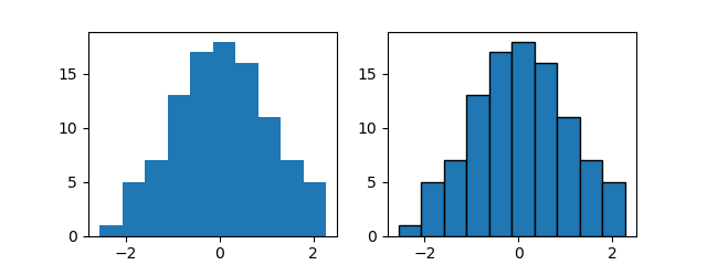
1次元の配列でデータを渡すと、その度数分布が描かれる。
ただしデフォルトでは各ビンのエッジが区別できないため、これを描くためにはedghecolorの指定が必要。edgecolorの代わりにecで指定してもよい。
|
|
import numpy as np import matplotlib.pyplot as plt np.random.seed(0) x = np.random.normal(0, 1, 100) fig, axs = plt.subplots(1,2, figsize=(6.4, 2.4)) axs[0].hist(x) axs[1].hist(x, edgecolor='k') plt.show() |
頻度分布
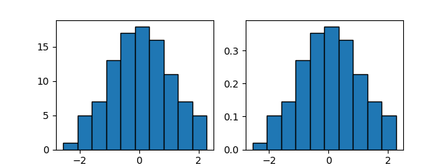
density=Trueを指定すると、頻度分布になる。各ビンの総和が1となるように調整され、形状は度数分布と同じ。
|
|
import numpy as np import matplotlib.pyplot as plt np.random.seed(0) x = np.random.normal(0, 1, 100) fig, axs = plt.subplots(1,2, figsize=(6.4, 2.4)) axs[0].hist(x, ec='k') axs[1].hist(x, density=True, ec='k') plt.show() |
累積分布図
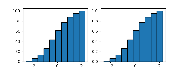
cumulative=Trueを指定すると、累積度数分布、累積頻度分布を描く。
|
|
import numpy as np import matplotlib.pyplot as plt np.random.seed(0) x = np.random.normal(0, 1, 100) fig, axs = plt.subplots(1,2, figsize=(6.4, 2.4)) axs[0].hist(x, cumulative=True, ec='k') axs[1].hist(x, cumulative=True, density=True, ec='k') plt.show() |
ビン数
binsでヒストグラムの柱(ビン)の数等を指定する。デフォルトはbins=10。
bins=n- ビンの数を数値で指定する。
bins=sequence- ビンの境界値をリスト等で指定する。
ビン(bin)は英語で、店の商品や工場の部品などを入れておく大きなケース、ストッカーのことをいい、British Englishではごみ箱を指す。日本語の瓶(びん)の呼び名とは関係ないらしい。
|
|
import numpy as np import matplotlib.pyplot as plt np.random.seed(0) x = np.random.normal(0, 1, 100) fig, axs = plt.subplots(1, 2, figsize=(6.4, 2.4)) axs[0].hist(x, bins=5, ec='k') axs[1].hist(x, bins=[-3, -2, -1, 0, 0.5, 1, 1.5, 2], ec='k') plt.show() |
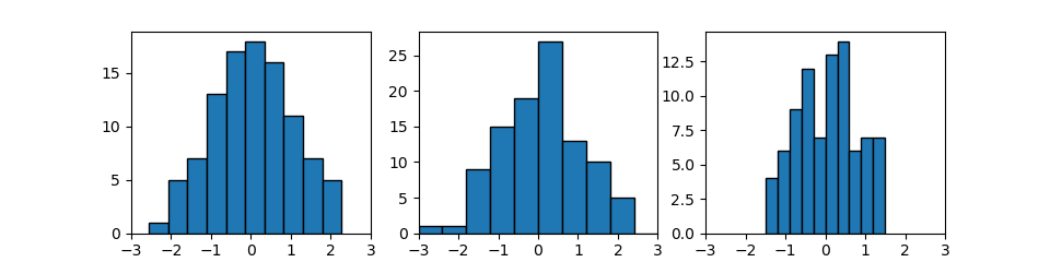
レンジ
rangeでヒストグラムのビンを分割する範囲を指定する。そのレンジの上下限値の間でbinsで指定されたビンに分割される。
1 2 3 4 5 6 7 8 9 10 11 12 13 14 15 16 17 18 |
import numpy as np import matplotlib.pyplot as plt np.random.seed(0) x = np.random.normal(0, 1, 100) fig, axs = plt.subplots(1, 3, figsize=(9.6, 2.4)) axs[0].hist(x, edgecolor='k') axs[1].hist(x, range=(-3, 3), ec='k') axs[2].hist(x, range=(-1.5, 1.5), ec='k') for ax in axs: ax.set_xlim(-3, 3) ax.set_xticks(np.arange(-3, 4, 1)) plt.show() |
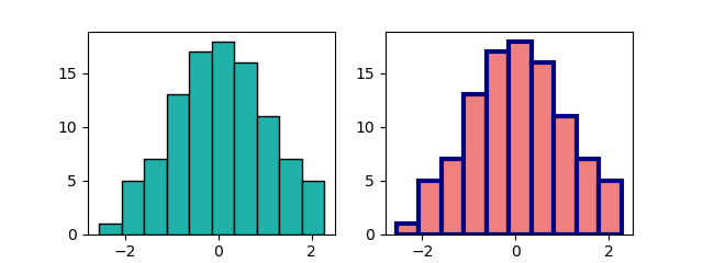
色・エッジの指定
colorでビンの色、edgecolor/ecでエッジの色、linewidthでエッジの幅を指定する。
|
|
import numpy as np import matplotlib.pyplot as plt np.random.seed(0) x = np.random.normal(0, 1, 100) fig, axs = plt.subplots(1, 2, figsize=(6.4, 2.4)) axs[0].hist(x, color='lightseagreen', edgecolor='k') axs[1].hist(x, color='lightcoral', ec='navy', linewidth=3) plt.show() |
ビンの幅
rwidthでビンの幅を指定する。デフォルトはrwidth=1で各ビンが密着。
|
|
import numpy as np import matplotlib.pyplot as plt np.random.seed(0) x = np.random.normal(0, 1, 100) fig, axs = plt.subplots(1, 2, figsize=(6.4, 2.4)) axs[0].hist(x, rwidth=0.8, ec='k') axs[1].hist(x, bins=13, width=1.2, ec='k') plt.show() |
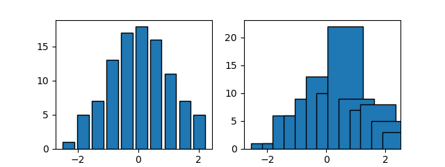
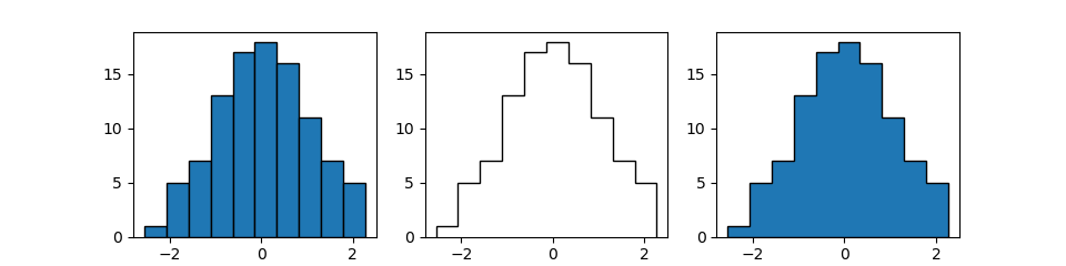
ヒストグラムのタイプ
histtype='type'でヒストグラムのタイプを指定する。
bar- 一般的なヒストグラムの形状。
barstacked- 複数のヒストグラムの場合に、同じビンの値を積み上げていく。
step- ビンの間の境界を描かない。
stepfilled- ビンの間の境界を描かず、中を塗りつぶす。
以下の例では、'bar'、'step'、'stepfilled'について例示。
|
|
import numpy as np import matplotlib.pyplot as plt np.random.seed(0) x = np.random.normal(0, 1, 100) fig, axs = plt.subplots(1, 3, figsize=(9.6, 2.4)) axs[0].hist(x, histtype='bar', ec='k') axs[1].hist(x, histtype='step', ec='k') axs[2].hist(x, histtype='stepfilled', ec='k') plt.show() |
複数のヒストグラム
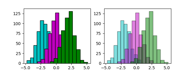
単純な重ね合わせ
複数のヒストグラムを重ね合わせるには、同じターゲットに対して各データについてhistを実行する。
単に重ね合わせると、初めの方のヒストグラムが後の方で塗りつぶされてしまうので、それらを見えるようにするにはalphaで透明度を指定する。
ただし単に重ね合わせただけの場合、各ヒストグラムのビンの境界が必ずしも一致しない。
1 2 3 4 5 6 7 8 9 10 11 12 13 14 15 16 17 18 19 20 |
import numpy as np import matplotlib.pyplot as plt np.random.seed(0) x1 = np.random.normal(-2, 1, 500) x2 = np.random.normal(0, 1, 500) x3 = np.random.normal(2, 1, 500) fig, axs = plt.subplots(1,2, figsize=(6.4, 2.4)) axs[0].hist(x1, color='c', edgecolor='k') axs[0].hist(x2, color='m', edgecolor='k') axs[0].hist(x3, color='g', edgecolor='k') axs[1].hist(x1, color='c', edgecolor='k', alpha=0.5) axs[1].hist(x2, color='m', edgecolor='k', alpha=0.5) axs[1].hist(x3, color='g', edgecolor='k', alpha=0.5) plt.show() |
ヒストグラムとplotの重ね合わせ
こちらを参照。
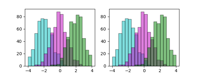
ビン境界の整合
複数のヒストグラムのビンの境界を一致させるには以下の方法がある。
- 各グラフに対して同じ
rangeとbins=nを指定する
- 各グラフに対して同じ
bins=sequenceを指定する
1 2 3 4 5 6 7 8 9 10 11 12 13 14 15 16 17 18 19 20 21 |
import numpy as np import matplotlib.pyplot as plt np.random.seed(0) x1 = np.random.normal(-2, 1, 500) x2 = np.random.normal(0, 1, 500) x3 = np.random.normal(2, 1, 500) fig, axs = plt.subplots(1,2, figsize=(6.4, 2.4)) axs[0].hist(x1, range=(-4, 4), bins=20, color='c', ec='k', alpha=0.5) axs[0].hist(x2, range=(-4, 4), bins=20, color='m', ec='k', alpha=0.5) axs[0].hist(x3, range=(-4, 4), bins=20, color='g', ec='k', alpha=0.5) bn = np.linspace(-4, 4, 21) axs[1].hist(x1, bins=bn, color='c', ec='k', alpha=0.5) axs[1].hist(x2, bins=bn, color='m', ec='k', alpha=0.5) axs[1].hist(x3, bins=bn, color='g', ec='k', alpha=0.5) plt.show() |
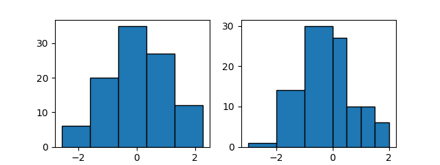
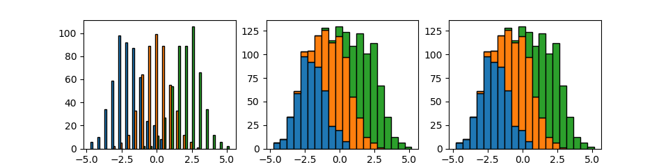
並べる・積み上げる
複数のデータを配列とした場合(複数の1次元のデータを並べて2次元配列として与えた場合)、デフォルトでは各ビンが横に並べられる。
また、stacked=Trueあるいはhisttype='barstacked'を指定した場合、同じ階級のビンが積み上げられる。
1 2 3 4 5 6 7 8 9 10 11 12 13 14 15 16 17 |
import numpy as np import matplotlib.pyplot as plt np.random.seed(0) x1 = np.random.normal(-2, 1, 500) x2 = np.random.normal(0, 1, 500) x3 = np.random.normal(2, 1, 500) X = [x1, x2, x3] fig, axs = plt.subplots(1,3, figsize=(9.6, 2.4)) axs[0].hist(X, bins=20, ec='k') axs[1].hist(X, bins=20, stacked=True, ec='k') axs[2].hist(X, bins=20, histtype='barstacked', ec='k') plt.show() |
戻り値
n- 各ビンの値(度数または頻度)
bins- 各ビンの境界値
patches- ヒストグラム描画に使われたpatcheオブジェクトのリスト
単一のヒストグラムの場合
以下の例では、nの結果として10個のビンの度数が得られている。
1 2 3 4 5 6 7 8 9 10 11 12 13 14 15 16 17 18 19 20 21 22 |
import numpy as np import matplotlib.pyplot as plt np.random.seed(0) x = np.random.normal(0, 1, 100) fig, ax = plt.subplots(1, 1, figsize=(6.4, 2.4)) n, bins, patches = ax.hist(x) print(n) print(bins) print(patches) plt.show() # [0.02073508 0.10367541 0.14514557 0.26955606 0.35249639 0.37323147 # 0.33176131 0.2280859 0.14514557 0.10367541] # [-2.55298982 -2.07071537 -1.58844093 -1.10616648 -0.62389204 -0.1416176 # 0.34065685 0.82293129 1.30520574 1.78748018 2.26975462] # <a list of 10 Patch objects> |
複数のヒストグラムの配列の場合
複数のデータを配列で与えた場合の戻り値。nが3つのデータごとの配列になっている。
1 2 3 4 5 6 7 8 9 10 11 12 13 14 15 16 17 18 19 20 21 22 23 24 25 26 27 28 29 |
import numpy as np import matplotlib.pyplot as plt np.random.seed(0) x1 = np.random.normal(-2, 1, 500) x2 = np.random.normal(0, 1, 500) x3 = np.random.normal(2, 1, 500) X = [x1, x2, x3] fig, ax = plt.subplots(1,1, figsize=(3.2, 2.4)) n, bins, patches = ax.hist(X, bins=20, ec='k') print(n) print(bins) print(patches) plt.show() # [array([ 6., 10., 34., 59., 98., 92., 87., 62., 24., 20., 8., 0., 0., # 0., 0., 0., 0., 0., 0., 0.]), array([ 0., 0., 0., 2., 5., 12., 33., 64., 89., 99., 89., 55., 33., # 12., 6., 1., 0., 0., 0., 0.]), array([ 0., 0., 0., 0., 0., 0., 0., 2., 2., 11., 27., # 54., 89., 89., 106., 66., 34., 12., 6., 2.])] # [-4.77259276 -4.27541438 -3.778236 -3.28105763 -2.78387925 -2.28670087 # -1.7895225 -1.29234412 -0.79516574 -0.29798737 0.19919101 0.69636938 # 1.19354776 1.69072614 2.18790451 2.68508289 3.18226127 3.67943964 # 4.17661802 4.6737964 5.17097477] # <a list of 3 Lists of Patches objects> |