相加相乗平均の不等式
一般系
(1) ![\begin{equation*} a_i \ge 0 \quad \Rightarrow \quad \sum_{i=1}^{n} a_i \ge n \sqrt[n]{\prod_{i=1}^{n} a_i} \end{equation*}](http://taustation.com/wp1/wp-content/ql-cache/quicklatex.com-7316e733b885728513bce2577cd689f4_l3.png "Rendered by QuickLaTeX.com")
2項の場合
(2) 
コーシー・シュワルツの不等式
(3) 
2項の場合
(4) 
グラフのx軸、y軸の位置や表示の有無については、Axesオブジェクトのspinesプロパティーで制御する。
spinesは辞書型でbottom、top、left、rightのキーで対象を指定し、表示位置はset_position()メソッド、表示の有無はset_visible()で操作する。
spines['bottom']とspines['left']は下と左の軸で、軸の値が表示される。
spines['top']とspines['right']は上と右の軸で、ただ線が引かれるだけ。
各軸に対して、set_positon()、set_visible()の各メソッドを実行して、位置や可視/不可視を設定する。
set_visible(False)で軸を非表示にする。
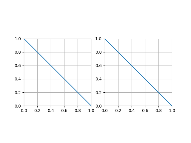
以下の例では、上の軸と右の軸を非表示にしている。
|
1 2 3 4 5 6 7 8 9 10 11 12 13 14 15 16 17 18 19 20 |
import numpy as np import matplotlib.pyplot as plt x = np.linspace(0, 1, 50) fig , axes = plt.subplots(1, 2) for ax in axes: ax.plot(x, 1 - x) ax.set_xlim(0, 1) ax.set_ylim(0, 1) ax.grid() ax.set_aspect('equal') axes[1].spines['right'].set_visible(False) axes[1].spines['top'].set_visible(False) plt.show() |
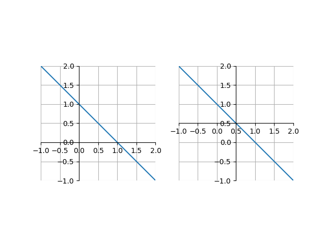
set_position(‘zero’)でゼロの位置に、set_position(‘center’)で描画位置の中央に軸をセットできる。set_visible()と組み合わせて使うケースが多そう。
|
1 2 3 4 5 6 7 8 9 10 11 12 13 14 15 16 17 18 19 20 21 22 23 24 25 26 27 28 29 |
import numpy as np import matplotlib.pyplot as plt x = np.linspace(-1, 2, 50) fig , axes = plt.subplots(1, 2) for ax in axes: ax.plot(x, 1 - x) ax.set_xlim(-1, 2) ax.set_ylim(-1, 2) ax.set_xticks(np.arange(-1, 2.5, 0.5)) ax.set_yticks(np.arange(-1, 2.5, 0.5)) ax.grid() ax.set_aspect('equal') ax.spines['right'].set_visible(False) ax.spines['top'].set_visible(False) axes[0].spines['bottom'].set_position('zero') axes[0].spines['left'].set_position('zero') axes[1].spines['bottom'].set_position('center') axes[1].spines['left'].set_position('center') plt.show() |
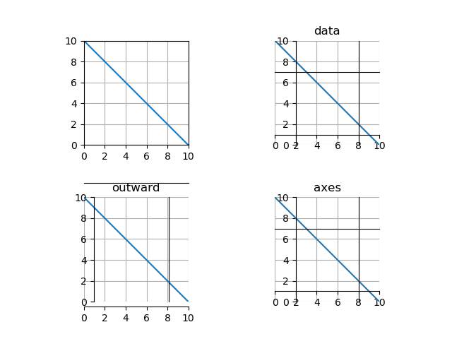
set_position()の引数として、タプルで('指定方法', 値)の形で与える。
| 指定方法 | 値 |
| data | 各軸を配置するx、yの値。 |
| outward | 単位はポイントで、正なら描画領域の内側、負なら外側に配置。 |
| axes | 描画領域の高さ・幅に対する割合。 |
|
1 2 3 4 5 6 7 8 9 10 11 12 13 14 15 16 17 18 19 20 21 22 23 24 25 26 27 28 29 30 31 32 33 34 35 36 37 38 39 40 41 42 43 |
import numpy as np import matplotlib.pyplot as plt x = np.linspace(0, 10, 50) fig , axes = plt.subplots(2, 2) for row in axes: for ax in row: ax.plot(x, 10 - x) ax.set_xlim(0, 10) ax.set_ylim(0, 10) ax.set_xticks(np.arange(0, 12, 2)) ax.set_yticks(np.arange(0, 12, 2)) ax.grid() ax.set_aspect('equal') ax = axes[0, 1] ax.set_title('data') ax.spines['bottom'].set_position(('data', 1)) ax.spines['left'].set_position(('data', 2)) ax.spines['top'].set_position(('data', 7)) ax.spines['right'].set_position(('data', 8)) ax = axes[1, 0] ax.set_title('outward') ax.spines['bottom'].set_position(('outward', 5)) ax.spines['left'].set_position(('outward', -10)) ax.spines['top'].set_position(('outward', 15)) ax.spines['right'].set_position(('outward', -20)) ax = axes[1, 1] ax.set_title('axes') ax.spines['bottom'].set_position(('axes', 0.1)) ax.spines['left'].set_position(('axes', 0.2)) ax.spines['top'].set_position(('axes', 0.7)) ax.spines['right'].set_position(('axes', 0.8)) fig.subplots_adjust(hspace=0.5) plt.show() |
直線 、点
、点 の距離を考える。直線と各点の記号、座標を以下のように定義する。
(1) 
まず、ベクトル が直線に直交することを示す。直線は以下のように媒介変数表示できて、ベクトル
 は直線に平行なベクトル。
(2) 
これを直線の式に代入して、
(3) 
ここで任意の に対して上式が成り立つことから、
 となり、ベクトルは直線に垂直であることが示された。
別解:点と直線の距離をパラメーター(媒介変数)によって愚直に求める方法
与えられた点 から直線への垂線の足を
 とすると、
とすると、 なので、以下が成り立つ。
(4) 
ここで は直線上にあることを考慮し、上式の左辺を以下のように変形できる。
(5) 
これより
(6) 
3次元空間内の平面は、たとえば以下のように表すことができる。
(7) 
一方、3次元平面上の点と法線ベクトル との直行条件から、以下のようにも表現できる。
(8) 
上記2つの式より、ベクトル は平面に対する法線ベクトルであることがわかる。
この法線ベクトルがベクトル と平行であることから、
(9) 
上式の左辺は以下のように変形できる。
(10) 
以上のことから、点 から三次元平面
 への距離については、以下で表される。
(11) 
n次元の超平面を以下の式で与える。
(12) 
このとき、これまでと同様の考え方により、点 と上記の超平面との距離は以下で表される。
(13) 
sort()メソッドは破壊的処理sort()はリストのメソッドで、元のリストの内容を変更する(破壊的処理)。メソッドの実行結果はNone。
降順にソートしたいときは、引数reverseをTrueで指定。
|
1 2 3 4 5 6 7 8 9 10 11 |
lst = [3, 2, 1, 5, 4] print(lst.sort()) print(lst) lst.sort(reverse=True) print(lst) # None # [1, 2, 3, 4, 5] # [5, 4, 3, 2, 1] |
sorted()関数は非破壊的処理sorted()関数は引数のリストのソート結果を返す。元のリストの内容は変更されない(非破壊的処理)。
降順ソートの指定はsort()メソッドと同じ。
|
1 2 3 4 5 6 7 8 9 10 11 12 |
lst = [3, 2, 1, 5, 4] print(sorted(lst)) print(lst) print(sorted(lst, reverse=True)) print() # [1, 2, 3, 4, 5] # [3, 2, 1, 5, 4] # [5, 4, 3, 2, 1] |
|
1 2 3 4 5 6 7 |
lst = ['ca', 'ba', 'aa', 'bb', 'ab'] print(sorted(lst)) print() # ['aa', 'ab', 'ba', 'bb', 'ca'] |
ndarrayの場合の注意sorted()はそのままではndarrayにならないndarrayをsorted()関数の引数にすると、エラーにはならないが結果はリストで返されるため、配列への変換が必要。
|
1 2 3 4 5 6 7 8 9 10 |
import numpy as np a = np.array([3, 2, 1, 5, 4]) print(sorted(a)) print(np.array(sorted(a))) print() # [1, 2, 3, 4, 5] # [1 2 3 4 5] |
numpy.sort()は非破壊的にndarrayをソートできるnumpy.sort()関数は、引数のndarrayのソート結果を返し、元のndarrayは変更しない。リストの場合のsorted()関数と同じ動作。
|
1 2 3 4 5 6 7 |
a = np.array([3, 2, 1, 5, 4]) print(np.sort(a)) print(a) # [1 2 3 4 5] # [3 2 1 5 4] |
ndarrayのsort()メソッドは破壊的ndarrayのsort()メソッドは、元の配列の内容を書き換える。リストのsort()メソッドと同じ挙動で、実行結果の戻り値はNone。
|
1 2 3 4 5 6 |
a = np.array([3, 2, 1, 5, 4]) print(a.sort()) print(a) # None # [1 2 3 4 5] |
今後
2つのリストの要素を並行して取得しつつ処理したい場合、zip()関数を用いる。
|
1 2 3 4 5 6 7 8 9 10 |
names = ['Jane', 'Bill', 'Lucy', 'Amanda'] ages = [34, 18, 25, 44] for name, age in zip(names, ages): print("{} is {} years old.".format(name, age)) # Jane is 34 years old. # Bill is 18 years old. # Lucy is 25 years old. # Amanda is 44 years old. |
zip()関数は、引数で与えた複数のコレクションの要素が対になったタプルのイテレーターを返す。各コレクションの長さが異なる場合、イテレーターの長さは最も短いコレクションの長さとなり、それ以降の各コレクションの要素は無視される。
|
1 2 3 4 5 6 7 8 9 10 11 12 |
lst1 = ['A', 'B', 'C'] lst3 = ['zero', 'one', 'two', 'three'] lst2 = [0, 1, 2, 3, 4] z = zip(lst1, lst2, lst3) for t in z: print(t) # ('A', 0, 'zero') # ('B', 1, 'one') # ('C', 2, 'two') |
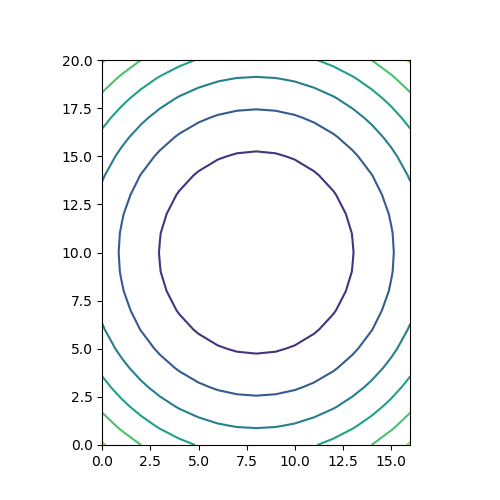
matplotlib.pyplot.contour()は2次元平面上のコンター(等値線)を描く。x, yの値から計算されたzの値が等しい点を曲線で結ぶ。
以下のコードでは、zの値のみを2次元配列で与えている。この場合は、配列zのインデックスの値が座標値となる(行番号0~20がy座標、列番号0~16がx座標)。
|
1 2 3 4 5 6 7 8 9 10 11 12 |
import numpy as np import matplotlib.pyplot as plt x = np.linspace(-1, 1, 17) y = np.linspace(-1.2, 1.2, 21) z = np.array([[u*u + v*v for u in x] for v in y]) fig = plt.figure(figsize=(5, 5)) ax = fig.add_subplot(111) ax.contour(z) ax.set_aspect('equal') plt.show() |
以下のコードでは、x, yを1次元配列で引数として渡している。この場合は、x, yの値が座標値として用いられる(x座標が-1~1、y座標が-1.2~1.2)。
|
1 2 3 4 5 6 7 8 9 10 11 12 |
import numpy as np import matplotlib.pyplot as plt x = np.linspace(-1, 1, 17) y = np.linspace(-1.2, 1.2, 21) z = np.array([[u*u + v*v for u in x] for v in y]) fig = plt.figure(figsize=(5, 5)) ax = fig.add_subplot(111) ax.contour(x, y, z) ax.set_aspect('equal') plt.show() |
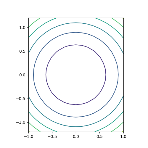
最も一般的な方法。x, yの1次元配列からnumpy.meshgrid()メソッドでそれぞれの2次元配列を生成し、それらを使ってzを計算するとともに、contour()の引数に与える。結果は上と同じになる。
|
1 2 3 4 5 6 7 8 9 10 11 12 13 |
import numpy as np import matplotlib.pyplot as plt x = np.linspace(-1, 1, 17) y = np.linspace(-1.2, 1.2, 21) x, y = np.meshgrid(x, y) z = x * x + y * y fig = plt.figure(figsize=(5, 5)) ax = fig.add_subplot(111) ax.contour(x, y, z) ax.set_aspect('equal') plt.show() |
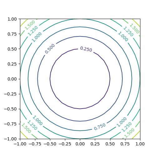
コンターの値をラベル表示させる。手順としては、contour()で描画した際の戻り値のオブジェクトを保存しておき、それをclabel()の引数として与える。
|
1 2 3 4 5 6 7 8 9 10 11 12 13 |
import numpy as np import matplotlib.pyplot as plt x = np.linspace(-1, 1, 21) y = np.linspace(-1, 1, 21) z = np.array([[u*u + v*v for u in x] for v in y]) fig = plt.figure(figsize=(5, 5)) ax = fig.add_subplot(111) cntr = ax.contour(x, y, z) ax.clabel(cntr) ax.set_aspect('equal') plt.show() |
コンターの数をlevelsで指定する。数値で指定する方法と、配列等で指定する方法があるが、数値で指定する方法は条件によって期待した結果にならないことがある。
1つの整数値で指定する場合、ドキュメンテーションでは以下のように書かれている。
“If an int n, use n data intervals; i.e. draw n+1 contour lines. The level heights are automatically chosen.”
すなわち、n個の間隔に対してn+1本のコンターが描かれることになっている。
以下のコードを実行してみる。
|
1 2 3 4 5 6 7 8 9 10 11 12 13 14 15 16 17 18 19 20 21 22 |
import numpy as np import matplotlib.pyplot as plt x = np.linspace(-1, 1, 21) y = np.linspace(-1, 1, 21) x, y = np.meshgrid(x, y) z1 = x + y z2 = x + y + 2 fig = plt.figure(figsize=(12, 5)) ax1 = fig.add_subplot(121) cntr = ax1.contour(x, y, z1, levels=5) ax1.clabel(cntr) ax1.set_aspect('equal') ax2 = fig.add_subplot(122) cntr = ax2.contour(x, y, z2, levels=5) ax2.clabel(cntr) ax2.set_aspect('equal') plt.show() |
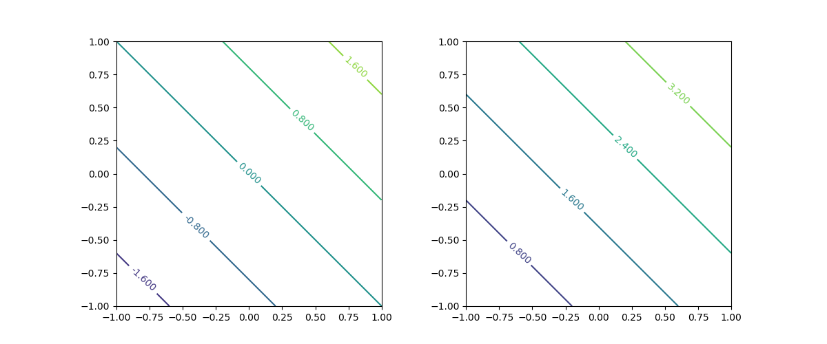
範囲と関数の関係によって、同じlevels=5を指定しているのにコンターの本数が異なる。ドキュメント通りなら、5つの間隔に対して6本のコンターが描かれるはずだが、左は6つの間隔に対して5本、右は5つの間隔に対して4本。
右の図の場合は左下でz2 = 0、右上でz2 = 4となり、コーナーの点がコンターに含まれているとすると勘定は合う。左はこれが合わないが、桁落ちなのかゼロが含まれるときに挙動が違うのか、よくわからない。
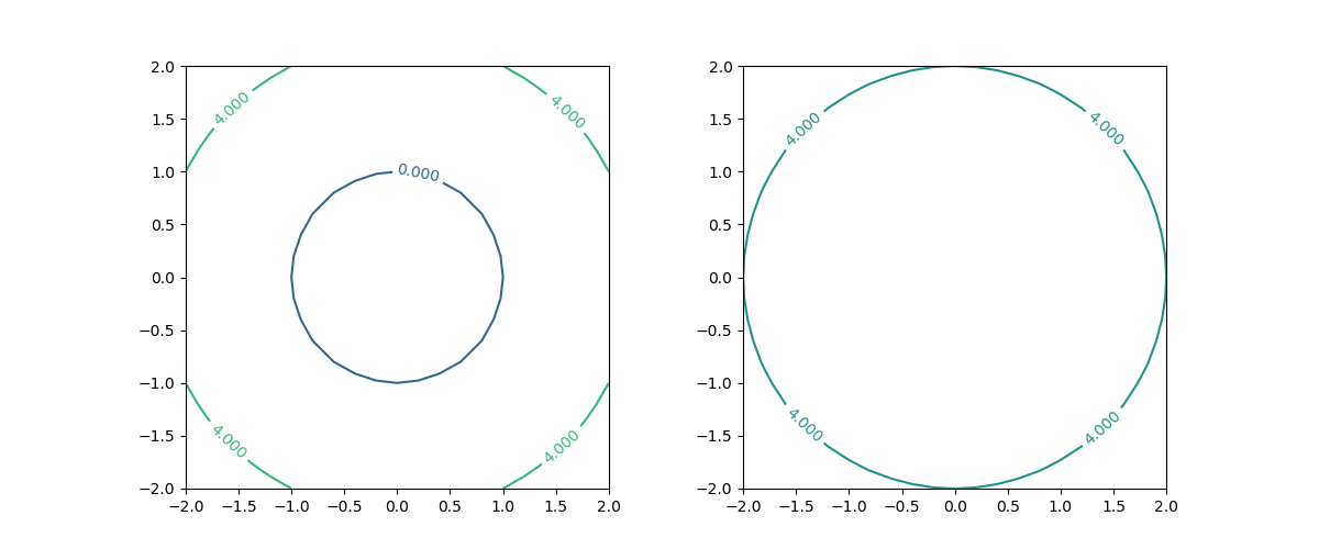
以下のようにlevels=1とした場合も、挙動が一定しない。
|
1 2 3 4 5 6 7 8 9 10 11 12 13 14 15 16 17 18 19 20 21 22 |
import numpy as np import matplotlib.pyplot as plt x = np.linspace(-2, 2, 21) y = np.linspace(-2, 2, 21) x, y = np.meshgrid(x, y) z1 = x * x + y * y - 1 z2 = x * x + y * y fig = plt.figure(figsize=(12, 5)) ax1 = fig.add_subplot(121) cntr = ax1.contour(x, y, z1, levels=1) ax1.clabel(cntr) ax1.set_aspect('equal') ax2 = fig.add_subplot(122) cntr = ax2.contour(x, y, z2, levels=1) ax2.clabel(cntr) ax2.set_aspect('equal') plt.show() |
levelsをリストなどで指定すると、その要素で指定された値のコンターを描く。要素は昇順でなければならない(昇順でない場合は実行時エラー)。
|
1 2 3 4 5 6 7 8 9 10 11 12 13 14 15 16 |
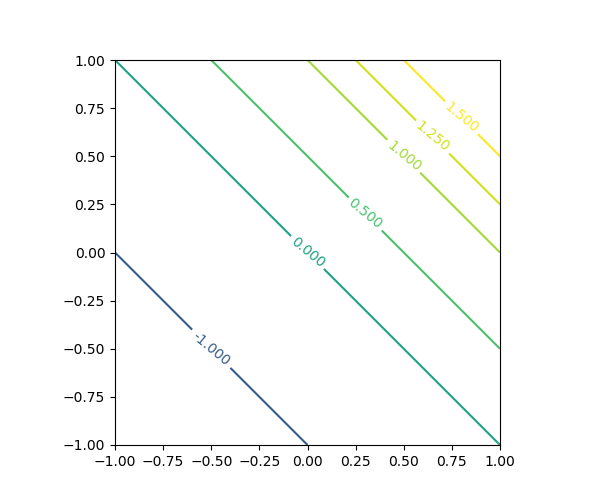
import numpy as np import matplotlib.pyplot as plt x = np.linspace(-1, 1, 21) y = np.linspace(-1, 1, 21) x, y = np.meshgrid(x, y) z = x + y fig = plt.figure(figsize=(6, 5)) ax = fig.add_subplot(111) cntr = ax.contour(x, y, z, levels=[-2, -1, 0, 0.5, 1, 1.25, 1.5]) ax.clabel(cntr) ax.set_aspect('equal') plt.show() |
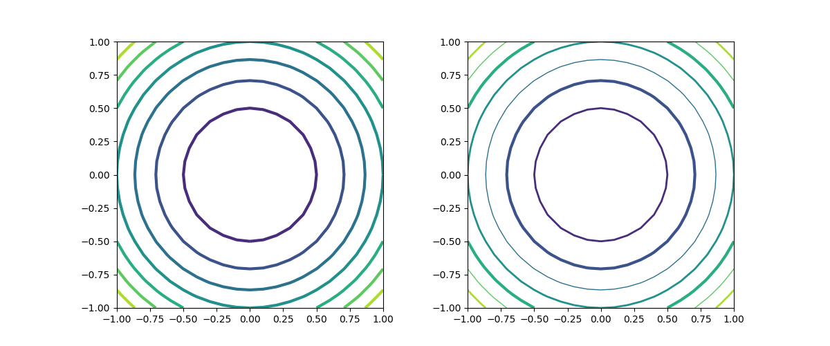
線の太さはlinewidthsで指定する。1つの数値で指定した場合は全てのコンターラインに適用、配列等で指定した場合は、サイクリックにその太さが適用される。赤字で示したように、引数名の最後に”s”が着く点に注意。
|
1 2 3 4 5 6 7 8 9 10 11 12 13 14 15 16 17 18 19 |
import numpy as np import matplotlib.pyplot as plt x = np.linspace(-1, 1, 21) y = np.linspace(-1, 1, 21) x, y = np.meshgrid(x, y) z = x * x + y * y - 1 fig = plt.figure(figsize=(12, 5)) ax1 = fig.add_subplot(121) ax1.contour(x, y, z, linewidths=3.0) ax1.set_aspect('equal') ax2 = fig.add_subplot(122) ax2.contour(x, y, z, linewidths=[1, 2, 3]) ax2.set_aspect('equal') plt.show() |
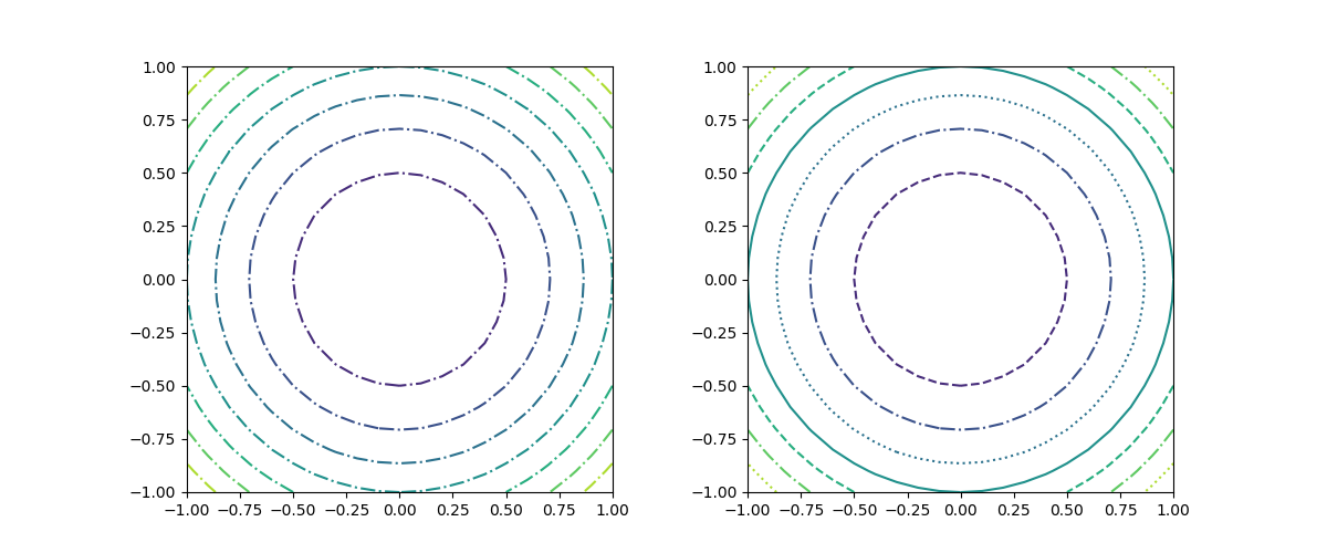
linestilesで、線のスタイルをスタイル名で指定する。複数指定した場合はサイクリックに適用される。
なお、線の色に単色を用いた場合は、負の値のコンターラインが破線('dashed')で描かれるが、この例は次のcolorsのところで示す。
|
1 2 3 4 5 6 7 8 9 10 11 12 13 14 15 16 17 18 19 |
import numpy as np import matplotlib.pyplot as plt x = np.linspace(-1, 1, 21) y = np.linspace(-1, 1, 21) x, y = np.meshgrid(x, y) z = x * x + y * y - 1 fig = plt.figure(figsize=(12, 5)) ax1 = fig.add_subplot(121) ax1.contour(x, y, z, linestyles='dashdot') ax1.set_aspect('equal') ax2 = fig.add_subplot(122) ax2.contour(x, y, z, linestyles=['solid', 'dashed', 'dashdot', 'dotted']) ax2.set_aspect('equal') plt.show() |
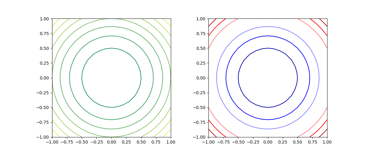
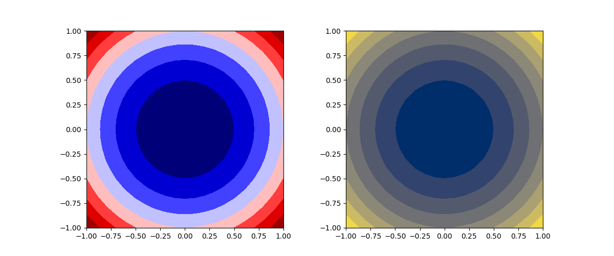
コンターラインの色はcolorsで指定する。配列等で指定するのが標準だが、単色の場合は配列化せず色名のみで指定可能。ただしその場合は、red, blue等の色名による指定方法のみ。
|
1 2 3 4 5 6 7 8 9 10 11 12 13 14 15 16 17 18 19 |
import numpy as np import matplotlib.pyplot as plt x = np.linspace(-1, 1, 21) y = np.linspace(-1, 1, 21) x, y = np.meshgrid(x, y) z = x * x + y * y - 1 fig = plt.figure(figsize=(12, 5)) ax1 = fig.add_subplot(121) ax1.contour(x, y, z, colors='blue') ax1.set_aspect('equal') ax2 = fig.add_subplot(122) ax2.contour(x, y, z, colors=['blue', 'green', 'red']) ax2.set_aspect('equal') plt.show() |
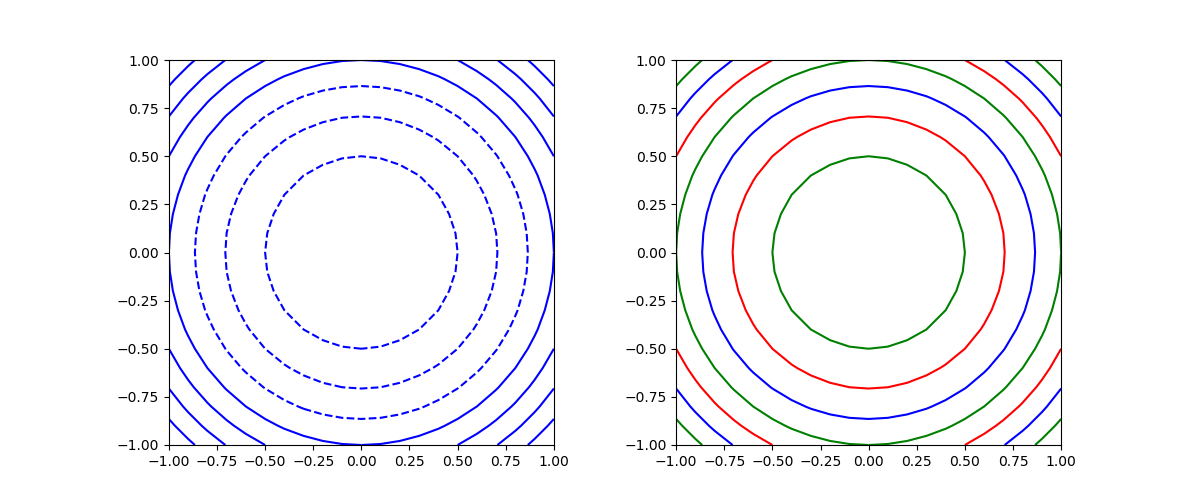
単色指定の場合、負の値に対するコンターは破線となる。
If linestyles is None, the default is ‘solid’ unless the lines are monochrome. In that case, negative contours will take their linestyle fromrcParams["contour.negative_linestyle"] = 'dashed' setting.
線の色にcolormapを適用できる。
|
1 2 3 4 5 6 7 8 9 10 11 12 13 14 15 16 17 18 19 |
import numpy as np import matplotlib.pyplot as plt x = np.linspace(-1, 1, 21) y = np.linspace(-1, 1, 21) x, y = np.meshgrid(x, y) z = x * x + y * y - 1 fig = plt.figure(figsize=(12, 5)) ax1 = fig.add_subplot(121) ax1.contour(x, y, z, cmap='summer') ax1.set_aspect('equal') ax2 = fig.add_subplot(122) ax2.contour(x, y, z, cmap='seismic') ax2.set_aspect('equal') plt.show() |
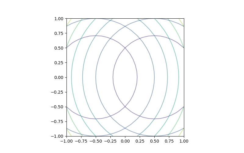
線によるコンターではあまり意味がないが、線の透過度を0 ~1の実数で指定できる。
|
1 2 3 4 5 6 7 8 9 10 11 12 13 14 15 16 17 |
import numpy as np import matplotlib.pyplot as plt x = np.linspace(-1, 1, 21) y = np.linspace(-1, 1, 21) x, y = np.meshgrid(x, y) z1 = (x + 0.5)**2 + y * y - 1 z2 = (x - 0.5)**2 + y * y - 1 fig = plt.figure(figsize=(8, 5)) ax = fig.add_subplot(111) ax.contour(x, y, z1, alpha=0.5) ax.contour(x, y, z2, alpha=0.5) ax.set_aspect('equal') plt.show() |
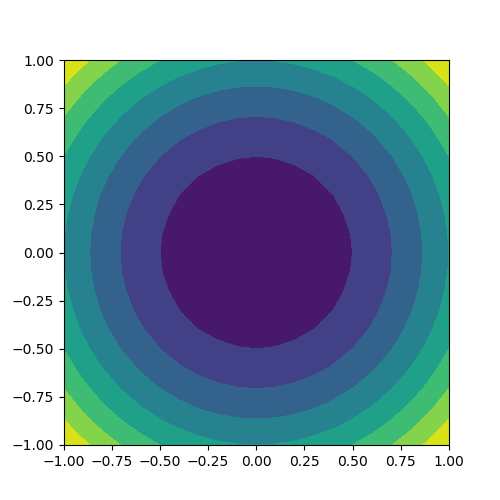
contourfはコンターラインで区切られた各エリアを色付けする。
|
1 2 3 4 5 6 7 8 9 10 11 12 13 |
import numpy as np import matplotlib.pyplot as plt x = np.linspace(-1, 1, 21) y = np.linspace(-1, 1, 21) x, y = np.meshgrid(x, y) z = x * x + y * y - 1 fig = plt.figure(figsize=(5, 5)) ax = fig.add_subplot(111) ax.contourf(x, y, z) ax.set_aspect('equal') plt.show() |
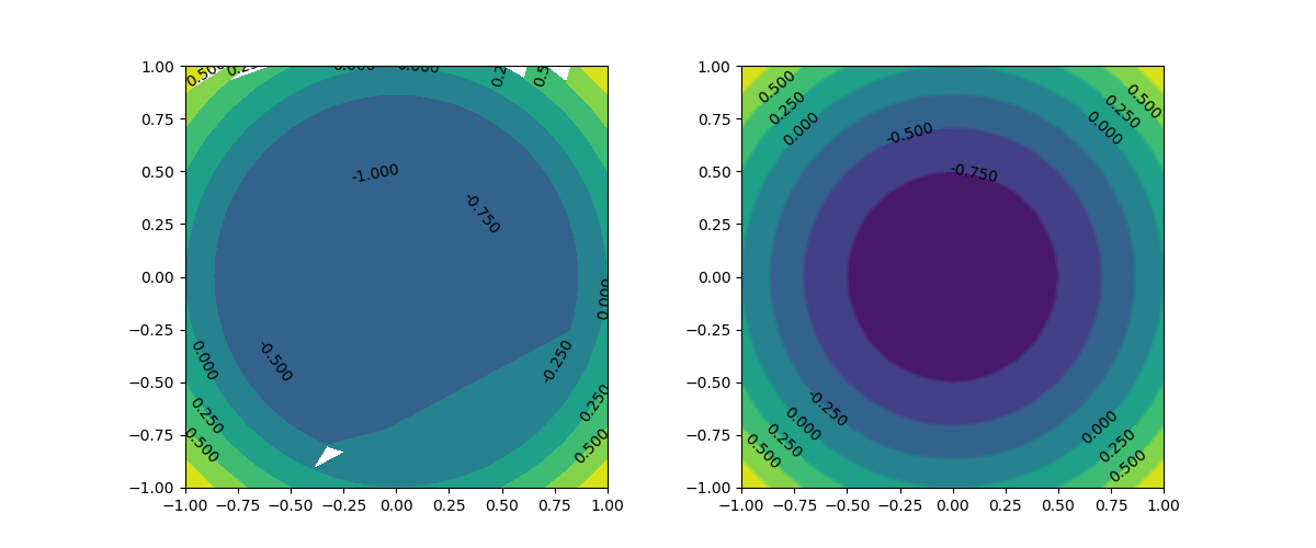
contourfでラベルを付けることはあまり想定されないが、contourと同じようにすると図が崩れてしまう。contourとcontourfの合わせ技がよい。
|
1 2 3 4 5 6 7 8 9 10 11 12 13 14 15 16 17 18 19 20 21 22 |
import numpy as np import matplotlib.pyplot as plt x = np.linspace(-1, 1, 21) y = np.linspace(-1, 1, 21) x, y = np.meshgrid(x, y) z = x * x + y * y - 1 fig = plt.figure(figsize=(12, 5)) ax1 = fig.add_subplot(121) cntr = ax1.contourf(x, y, z) ax1.clabel(cntr, colors='black') ax1.set_aspect('equal') ax2 = fig.add_subplot(122) ax2.contourf(x, y, z) cntr = ax2.contour(x, y, z) ax2.clabel(cntr, colors='black') ax2.set_aspect('equal') plt.show() |
コンターエリアの色分けにカラーマップを指定できる。
|
1 2 3 4 5 6 7 8 9 10 11 12 13 14 15 16 17 18 19 |
import numpy as np import matplotlib.pyplot as plt x = np.linspace(-1, 1, 21) y = np.linspace(-1, 1, 21) x, y = np.meshgrid(x, y) z = x * x + y * y - 1 fig = plt.figure(figsize=(12, 5)) ax1 = fig.add_subplot(121) ax1.contourf(x, y, z, cmap='seismic') ax1.set_aspect('equal') ax2 = fig.add_subplot(122) ax2.contourf(x, y, z, cmap='cividis') ax2.set_aspect('equal') plt.show() |
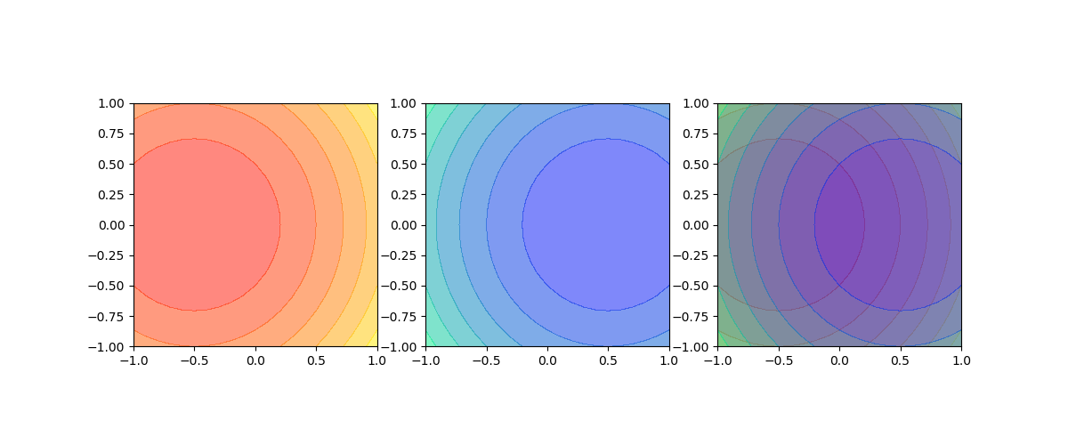
透過度を1未満に設定して、透過させることができる。
|
1 2 3 4 5 6 7 8 9 10 11 12 13 14 15 16 17 18 19 20 21 22 23 24 25 |
import numpy as np import matplotlib.pyplot as plt x = np.linspace(-1, 1, 21) y = np.linspace(-1, 1, 21) x, y = np.meshgrid(x, y) z1 = (x + 0.5)**2 + y * y - 1 z2 = (x - 0.5)**2 + y * y - 1 fig = plt.figure(figsize=(12, 5)) ax1 = fig.add_subplot(131) ax1.contourf(x, y, z1, cmap='autumn', alpha=0.5) ax1.set_aspect('equal') ax2 = fig.add_subplot(132) ax2.contourf(x, y, z2, cmap='winter', alpha=0.5) ax2.set_aspect('equal') ax3 = fig.add_subplot(133) ax3.contourf(x, y, z1, cmap='autumn', alpha=0.5) ax3.contourf(x, y, z2, cmap='winter', alpha=0.5) ax3.set_aspect('equal') plt.show() |
ndarrayの要素に以下のような条件式を指定すると、条件に適合した要素を取り出せる。
|
1 2 3 4 |
a = np.array([0, 1, 2, 3, 4, 5]) print(a[a%2==0]) # [0 2 4] |
これは次のような仕組みになっている。
まず配列の要素として、要素数と同数の論理値(True/False)を格納した配列を指定すると、Trueに対応した要素のみを要素とする配列が返される。
|
1 2 3 4 |
a = np.array([0, 1, 2, 3, 4, 5]) print(a[[False, True, True, False, True, False]]) # [1 2 4] |
一方、配列全体を条件式とすると、各要素について条件判定を行った結果(True/False)を要素とする配列が返される。
|
1 2 3 4 |
a = np.array([0, 1, 2, 3, 4, 5]) print(a%2==0) # [ True False True False True False] |
したがって、配列の要素に配列全体の条件式を適用すると、その条件判定がTrueとなる要素からなる配列が返される。
上記の応用で、以下のように配列aの要素を配列bの条件により取り出すことができる。
|
1 2 3 4 5 |
a = np.array([0, 1, 2, 3, 4, 5]) b = np.array([0, 1, 1, 0, 1, 0]) print(a[b==1]) # [1 2 4] |
この方法は、元データからクラス分類に応じたデータのみを取り出すときなどに使える。
たとえば以下は、5組の座標値のセットXから、クラスyが1となる座標値のサブセットを取り出すイメージ。
|
1 2 3 4 5 6 7 8 9 10 11 12 |
X = np.array([ [0, 1], [2, 3], [4, 5], [6, 7], [8, 9]]) y = np.array([0, 1, 1, 0, 1]) print(X[y==1]) # [[2 3] # [4 5] # [8 9]] |
条件に適合した列のみ取り出す場合には、少し工夫が必要で、内包表記と条件指定を組み合わせる。
以下の例では、配列yで抽出したい列を1としていて、内包表記で配列を取り出す際にこれを利用している。
|
1 2 3 4 5 6 7 8 9 10 |
X = np.array([ [0, 1, 2, 3], [4, 5, 6, 7], [8, 9, 10, 11]]) y = np.array([0, 1, 1, 0]) print(np.array([r[y==1] for r in X])) # [[ 1 2] # [ 5 6] # [ 9 10]] |
matlib.pyplotの各グラフの一般的な設定をまとめておく。なお、カラー、線のスタイル、マーカーの設定はそれぞれ以下を参照
scatter(x, y)scatter(x, y, marker=markerstyle, c=color)c=/color=のどちらでもよい。scatter(x, y, marker=markerstyle, s=size, color=color)plot(x, y)plot(x, y, c=color)c=/color=のどちらでもよいplot(x, y, linestyle=linestyle, linewidth=width)plot(x, y, marker=markerstyle, markersize=size)plot(x, y, styles[, x, y, styles]...)g^--‘のように表現。複数の線をまとめて指定可能。barh(y, width)hist(y, width, fc, ec, linewidth)hist(data, bins=bins, label=label)hist(data, bins=bins, range=(min, max), color=color, edgecolor=color, linewidgh=width)hist(data, density=True)hist(data, alpha=alpha)hist([data1, data2,...], bins=bins, color=[c1, c2,...], label=[l1, l2,...])hist([data1, data2,...], bins=bins, stacked=True)円グラフ
pie(data, radius=r, counterclock=False, startangle=90, labels=labels, autopct=pctstring)radiusは通常デフォルトの1を使う。counterclockとstartangleはいちいち指定しないといけない。autopctの書式の基本形は、たとえば"%.1f"。ラベルとパーセンテージの位置を、半径の割合で指定可能(labeldistance, pctdistance)pie(data, counteerclock=False, startangle=90, explode=explodelist)explodeで各データの中心からの位置をリスト指定。同じ小さい値を全データにい指定するとデータ間に隙間ができる。特定データの値を大きくすると、そのデータのみ飛び出る。pie(data, counteerclock=False, startangle=90, wedgegroups={'linewidgh':width, 'edgecolor'=color)ドーナツ型の
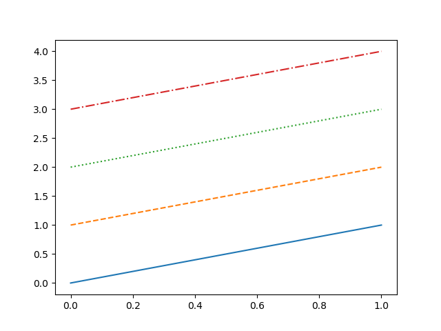
一般に使われる4つのスタイルについては、文字列あるいは記号で指定。
"solid" |
“-“ | 連続線 |
"dashed" |
“–“ | 破線 |
"dotted" |
“:” | 点線 |
"dashdot" |
“-.” | 一点鎖線 |
文字列指定の例
|
1 2 3 4 5 6 7 8 9 10 11 12 13 14 15 |
import numpy as np import matplotlib.pyplot as plt fig = plt.figure() ax = fig.add_subplot(111) x = np.array([0, 1]) y = np.array([0, 1]) ax.plot(x, y, linestyle="solid") ax.plot(x, y+1, linestyle="dashed") ax.plot(x, y+2, linestyle="dotted") ax.plot(x, y+3, linestyle="dashdot") plt.show() |
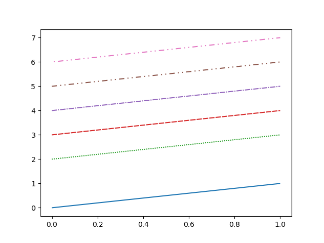
記号指定の例
|
1 2 3 4 |
ax.plot(x, y, linestyle="-") ax.plot(x, y+1, linestyle="--") ax.plot(x, y+2, linestyle=":") ax.plot(x, y+3, linestyle="-.") |
実行結果
タプルによって、任意のパターンを設定することができる。
(offset, (fg, bg, fg, bg, ...))
第2要素のタプルの中で、前景色の長さと背景色の長さを交互に指定。第1要素は病か開始のオフセット。
|
1 2 3 4 5 6 7 |
ax.plot(x, y, linestyle=(0, (1, 0))) ax.plot(x, y+1, linestyle=(0, (0, 1))) ax.plot(x, y+2, linestyle=(0, (1, 1))) ax.plot(x, y+3, linestyle=(0, (5, 1))) ax.plot(x, y+4, linestyle=(0, (5, 1, 1, 1))) ax.plot(x, y+5, linestyle=(0, (5, 3, 1, 3, 1, 3))) ax.plot(x, y+6, linestyle=(10, (5, 3, 1, 3, 1, 3))) |
とりあえずのメモ書き。
'b' |
blue/青 | ■ |
'g' |
green/緑 | ■ |
'r' |
red/赤 | ■ |
'c' |
cyan/シアン | ■ |
'm' |
magenta/マゼンタ | ■ |
'y' |
yellow/黄 | ■ |
'k' |
black/黒 | ■ |
'w' |
white/白 | □ |
各種グラフのデフォルトで用いられる標準色がある。
濃淡のレベルを”文字列で”指定。
color=['0.0', '0.2', '0.4', '0.6', '0.8', '1.0']